
Logo Placement Guidelines That Actually Work in 2026
Other
You can have a sharp logo, a polished reel, and a clean template, then lose the whole brand moment because the mark sits under captions, clips at the edge, or disappears in a thumbnail. That's the part most logo placement guidelines gloss over. The true test isn't whether a logo looks balanced in Figma, it's whether it still reads when a creator subtitle, a platform button stack, and a fast thumb swipe all compete for the same corner.
Why Logo Placement Matters More When You Repurpose Video
A finished long-form edit becomes a different product the moment it's clipped into vertical shorts. The frame tightens, captions get burned in, and the UI starts claiming territory that used to be empty. What looked disciplined on a website header can turn messy on a 9:16 export, because the logo is now fighting for attention with moving faces, lower-third subtitles, and app controls.
That's why the old habit of “just put it in a corner” only works when the corner is still available. On short-form video, it often isn't. The lower part of the frame is busy with captions, and the right edge is usually where action buttons live, so a mark that seemed harmless in a static comp can become unreadable or cropped the second it hits TikTok, Reels, or Shorts. The practical answer is a placement system that survives repurposing, not a one-off design choice.
For a clean starting point, I like pairing the technical basics with a good visual reference, and expert logo design from Skup is useful if you want to see how a mark is constructed before it's placed. That matters because a logo with weak geometry or cramped spacing is harder to rescue later.
Practical rule: Design the placement for the final viewing environment, not the source file. A logo that reads in a static header can still fail inside a vertical clip.
The rest of the workflow is straightforward. Lock the mark to a stable corner, define clear space from the logo itself, size it for the medium, and test it against the platform overlays you know will show up. If you do that consistently, logo placement stops being decoration and starts acting like a usable system.
The Core Logo Placement Rules Every Brand Should Follow
A strong logo system starts with one boring truth, consistency beats cleverness. The most common default across websites, navigation bars, and presentation layouts is the top-left corner. Multiple brand and UX references treat that as the standard anchor, while presentation decks often shift to the top-right corner with a fixed inset from the edge instead of floating the mark wherever it feels balanced visually. The point is never “corners are pretty,” it's that corners give the logo a repeatable home.
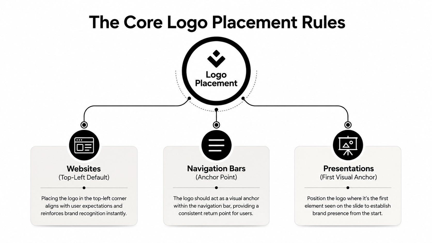
Corner placement is a system, not a style choice
On websites and navigation bars, the logo is part of the interface, so it needs a stable location that users can learn once and recognize forever. On slides, the logic shifts slightly because the logo is usually a recurring support element rather than the primary anchor, which is why a top-right inset can work well there. The difference is medium, not philosophy.
That same logic applies to clear space. Brand guidelines commonly define protected space from a fixed internal metric, like the cap height or symbol width, and recommend 1× to 1.5× that unit on all sides, with one formal manual specifying 25 percent of the logo height as side clearance inkbotdesign.com/logo-placement. That's a better rule than “give it some room,” because it scales with the mark instead of with a random canvas size.
Measure from the logo, not from the layout
Many systems break down in this area. Teams measure from an artboard edge, then wonder why the logo feels cramped in a smaller template and lonely in a larger one. The cleaner method is to anchor spacing to the logo's own internal geometry, such as symbol height, cap height, or the width of a dominant letterform.
Keep the protected area free of other elements on every side. If there's any uncertainty, give the logo more room, not less.
If you're building a custom identity system, custom logo design can be a useful lens for this kind of geometry-first thinking, because placement and construction are tied together from the start. The same is true whether the mark lives in a website header, a slide deck, or a social template. The coordinate changes, the geometry doesn't.
Minimum Size, Scale, and Contrast for Legible Marks
A logo can sit in the right corner and still fail if it is too small or too close to the background. Scale and contrast need their own rules, separate from placement. Start by deciding how the mark has to read at its smallest intended use, then build the rest of the system from that point instead of shrinking a large master file until it seems acceptable.
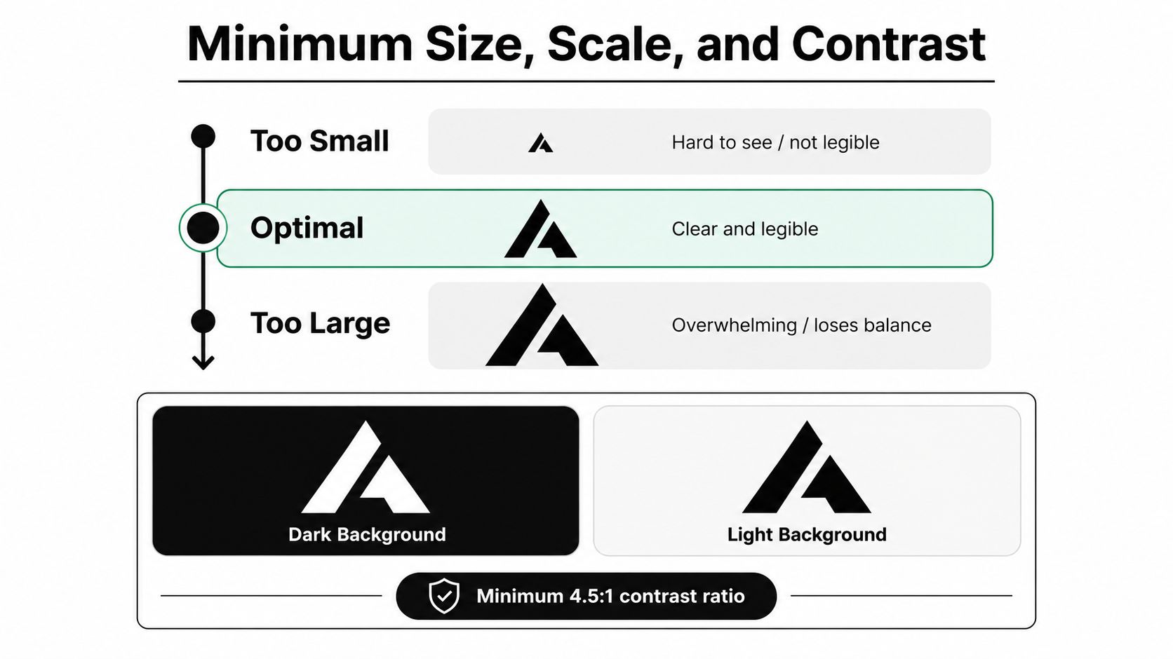
Scale should stay proportional
Brand guidance recommends keeping the logo in the top-left corner by default, and for mobile viewports narrower than 480px, keeping it centered or left-aligned so menu controls do not overlap it logotouse.com. That matters because small screens leave little margin for error. If the logo shares space with navigation icons, placement has to protect interaction first.
The same guidance also notes that presentation decks commonly use the top-right corner with a 0.3 to 0.5 inch inset from the edges. That offset shows why size is never only about width. A mark can be proportionally correct and still feel pinned too hard to the edge, which makes the layout look cramped.
Short-form video adds another constraint. In a captioned frame, scale has to survive the tiny preview as well as the full-screen view, and that is where a mark that looks fine in a deck can fall apart. A clean lower-third can help frame a logo, but only if the mark stays clear of the text band and does not compete with it, which is why Klap's guide to what a lower third is is useful context for editors working in that space.
Contrast decides whether the logo is visible at all
A logo needs to read against the dominant background, not just sit on top of it. In practice, that means keeping both a light and dark version of the same mark ready so you can switch without resizing or distorting anything. If the logo fades into a busy frame, viewers will read it as clutter, not branding.
Useful shortcut: If the logo disappears first in a thumbnail or preview grid, the size is too small or the contrast is too weak.
Teams often correct the wrong problem. They scale the mark up until it becomes visible, then it starts fighting the content. The cleaner fix is to preserve aspect ratio, choose the right color variant, and be honest about the smallest context the logo has to survive. For captioned video, that smallest context is often not the export file, it is the tiny preview where the first scroll decision happens.
A quick note on framing helps too. Logos, captions, and title bars often compete in the same visual band, so the placement decision has to account for all three before export. That collision is why scale and contrast need to be planned, not guessed.
Platform-Specific Logo Placement for Short-Form Video
Short-form video changes the placement problem because the frame is already occupied before your logo ever appears. Captions, creator UI, and the fast scan people do while swiping all compete for the same pixels, so the old idea of a clean corner only works if that corner stays clear after the app adds its overlays. Social and video guidance points brands toward the bottom-right or top-left corner at about 5 to 10 percent of image width, while warning against the bottom fifth because captions live there and the right edge because action buttons live there barnimages.com. That is the actual map, not the empty canvas many templates assume.
Visibility beats discretion when the frame is crowded
For repurposed clips, visibility matters more than subtlety. A logo that nobody can see does not help recognition, and in a fast feed, viewers rarely stop to search for a mark. The top-left corner is usually the safest visible zone because it stays away from the caption band and the action stack, while bottom-right can work when the composition needs the logo to feel quieter.
The trade-off is straightforward. Top-left reads earlier. Bottom-right recedes more. Neither choice fits every edit, but the mark should still sit high enough to avoid creator subtitles and far enough from the right edge to avoid UI collisions. Traditional web logic starts to break the moment the platform layers land on top of the frame.
Safe zones matter more than exact pixels
Platform overlays change the job of a watermark. The bottom fifth gets crowded by captions, and the right edge gets taken by buttons, so the tidy-looking lower-right placement can fail as soon as the app interface appears. That is why I would rather see a brand mark in the upper-left with real breathing room than centered just because it looked neat in a static preview.
If you are editing for a short-form workflow, Klap's Instagram video guide is useful because the same repurposed clip often needs to hold up across more than one platform layout. The better your logo placement survives the first export, the less time you spend rebuilding versions for each feed.
On vertical shorts, the logo should protect the hook, not compete with it.
A quick audit catches most problems. Check one version on a light background, one on a dark background, and one mobile preview with captions fully visible. If the mark overlaps the subtitle zone or the right-side controls, move it immediately. On short-form, that is usually the difference between a professional watermark and a misplaced sticker.
How Placement Rules Adapt Across Web, Apparel, and Decks
The core logic of logo placement stays consistent, but the surface changes the decision. A web header asks the logo to act like a fixed interface anchor. A presentation deck needs a repeatable identity mark that stays present without stealing attention from the slide. Apparel asks for something else again, because the logo has to work on a moving body where seams, folds, and fabric tension all change the canvas.
Apparel follows body geometry, not screen geometry
Apparel branding usually treats the left chest as the standard front placement, with a recommended logo size of 2.5 to 5 inches wide and 2.5 to 5 inches tall safeguardbyinnovative.com. The same guide places the design about 7 to 9 inches down from the left shoulder seam, or 4 to 6 inches right of center safeguardbyinnovative.com. For back placement, it recommends sitting the logo about 5 inches from the collar and sizing it roughly 10 to 14 inches wide by 6 to 15 inches tall safeguardbyinnovative.com.
That level of placement control matters because clothing is not a flat screen. Seams cut through the field, curves bend the mark, and motion changes how much of the logo people see. A left-chest mark that feels modest in a mockup can read clearly once it is on a person. Apparel rewards fixed reference points more than guesswork, especially when the garment is meant to hold up in motion.
Slides and navigation reward restraint
Presentation decks commonly use the top-right corner with a 0.3 to 0.5 inch inset, which keeps the logo present without pulling focus from the content logotouse.com. Websites usually default to the top-left, because that is where users expect the brand and where navigation often begins. The difference is small, but it changes the job of the mark. A deck is a branded container. A site header is part of the interface itself.
MediumPrimary CornerLogo SizeEdge Offset / Safe Zone
Website header
Top-left
Proportional to header space
Protected clear space from the logo itself
Presentation deck
Top-right
Small recurring mark
0.3 to 0.5 inch inset from edges logotouse.com
Apparel, left chest
Left chest
2.5 to 5 inches wide and tall safeguardbyinnovative.com
7 to 9 inches down from shoulder seam or 4 to 6 inches right of center safeguardbyinnovative.com
The pattern is consistent across all three. Start with a stable anchor, respect the safe zone, and size the mark for the distance at which people will read it. In video workflows, that same logic still applies, but the frame now has overlays, captions, and controls competing for the same space. When a watermark needs to stay visible without fighting those elements, a technical removal reference for watermarks is useful because it shows how quickly a poorly placed mark becomes a distraction.
Do's and Don'ts for Watermarking Vertical Shorts
Watermarking short-form video is where brand teams start making trade-offs they can't ignore. The logo should be visible, but it cannot take over the clip. It should support brand recognition, but it should not drag down retention or block the hook. In vertical shorts, the mark has to be readable first and decorative second, because the frame is crowded before the edit even starts. A quick counterpoint is the Klap watermark removal guide, which makes it obvious how fast a badly placed mark turns into a distraction.
What works in practice
The safest watermark choices are plain, and that is the point. A high-contrast mark in a top corner, sized at about 5 to 10 percent of image width, gives you a sensible starting place barnimages.com. It stays visible without swallowing the frame, and it avoids the caption band, which is one of the worst places to place a logo in short-form video.
I also recommend testing two versions before you publish. One version can be a little more visible, and the other can sit back more subtly. TikTok, Instagram Reels, and YouTube Shorts do not expose the frame in exactly the same way, so a placement that looks clean in one app can feel cramped in another. That is not a design mistake, it is the reality of platform UI.
What fails immediately
Centering the logo in a vertical short only works if the mark is part of a deliberate title moment. Otherwise it gets in the way of the hook, and if subtitles are burned in, the logo competes with the most important words on screen. The bottom third is just as risky. Captions, progress indicators, and user attention already live there.
A few more mistakes show up fast:
- Edge bleed: A logo pinned right to the frame edge can get cropped when the platform adds overlays or when the video is viewed in a different aspect treatment.
- Low-opacity ambiguity: If the mark is so faint that viewers can't identify it, it reads like noise instead of branding.
- Animated distraction: A moving logo can pull attention away from the first second of the clip, which is usually the part that matters most.
The best short-form watermark feels like part of the edit. In practice, that usually means a static mark, strong contrast, and a corner that stays clear even after subtitles and UI elements are added.
Pre-Publish Logo Placement Checklist for Klap Users
A fast export check catches most logo problems before they go public. I run the same review on every batch of shorts, because consistency is the point. If the mark survives the checklist once, it can survive a whole template family.
A one-minute placement audit
- Confirm the anchor: The logo should sit in a corner, not in the middle of the frame, and it should look intentionally locked into place rather than loosely dropped in.
- Check frame width: Keep the mark within the social guidance range of about 5 to 10 percent of image width so it reads without taking over.
- Protect the caption band: Leave the bottom fifth clear, because that is where subtitles and platform text are most likely to collide with the mark.
- Test both backgrounds: Make sure the logo still reads on light and dark sections of the clip.
- Preview on mobile: Check whether creator subtitles or UI elements hide part of the mark on a phone-sized view.
- Preserve proportions: If the export was reframed, do not stretch the logo to fit the new crop.
- Use a layout grid: Build the safe zone from the symbol height or capital height, then keep the surrounding area clear, as cross-format guidance recommends logomax.com.
The point of the checklist is not to make the logo louder. It is to make the placement defensible. If a stakeholder asks why it sits there, the answer should be simple. The corner is stable, the clear space is deliberate, the contrast works, and the mark will not get buried by captions or controls.
That is the standard worth shipping. Pick one placement system, build it around the logo's own geometry, and test it in the production environments where your audience watches.
A final pass on a short-form export usually tells you more than a mockup ever will. A mark can look clean in a design file and still lose to captions, repost UI, or a progress bar once it is inside a vertical player. barnimages.com covers the same basic discipline for social graphics, and the practical lesson carries over here. Keep the logo calm, keep the safe area honest, and assume the platform will claim more of the frame than your layout preview shows.
If you want a faster way to turn long videos into short clips with captions and social-friendly framing, try Klap and use the checklist above before you export each batch.