Thumbnail Size for YouTube Videos: The 2026 Guide
Other

You spent hours on the script, editing, pacing, sound, and story. You publish. Then the video limps out of the gate.
Most creators blame the topic, the algorithm, or upload timing first. Sometimes those matter. But very often, the problem is simpler. People did not click.
That is why understanding thumbnail size for youtube videos matters more than it seems. A thumbnail is not decoration. It is the packaging, the promise, and the first test your video has to pass before anyone hears a word you say.
Your Thumbnail Is Your Video's Most Important Salesperson
YouTube is a browsing platform before it is a viewing platform. People scroll search results, home feeds, suggested videos, and TV interfaces, making snap decisions from tiny visual cues.
Your thumbnail does most of that persuasion work.
The performance gap between “good enough” and “strategic” is not small. Research demonstrates that 90% of the best-performing videos on YouTube use custom thumbnails, and videos with custom thumbnails achieve 60–70% higher click-through rates on average according to Lemonlight’s analysis of thumbnail performance data.
That stat should change how you think about production. The thumbnail is not the last step. It is part of the video itself.
Why creators underestimate it
A lot of talented creators make this mistake:
- They treat the thumbnail like export paperwork: The video is done, energy is low, and they grab a random frame.
- They design for themselves, not the feed: A beautiful image at full size often fails when shrunk down.
- They focus on accuracy only: Accuracy matters, but a thumbnail also has to create curiosity, clarity, and emotional pull.
The thumbnail is your first sales conversation with a stranger. It has to answer two questions instantly:
- What is this about?
- Why should I care right now?
If either answer is fuzzy, the scroll continues.
The click changes everything after it
The thumbnail does not just affect vanity metrics. It affects whether YouTube gets positive early signals from viewers. If more people choose your video when it is shown, your video earns more chances to be shown again.
That is the practical “aha” moment. A stronger thumbnail does not merely improve appearance. It improves distribution.
Key takeaway: A weak thumbnail can bury a strong video. A strong thumbnail gives a strong video the chance to prove itself.
Creators often obsess over camera gear and editing tricks while leaving the most visible part of the package underdeveloped. That is backwards. If your thumbnail cannot win the click, the rest of your effort stays hidden.
The Official YouTube Thumbnail Specs You Must Know
The technical side is straightforward once you know the few numbers that matter.
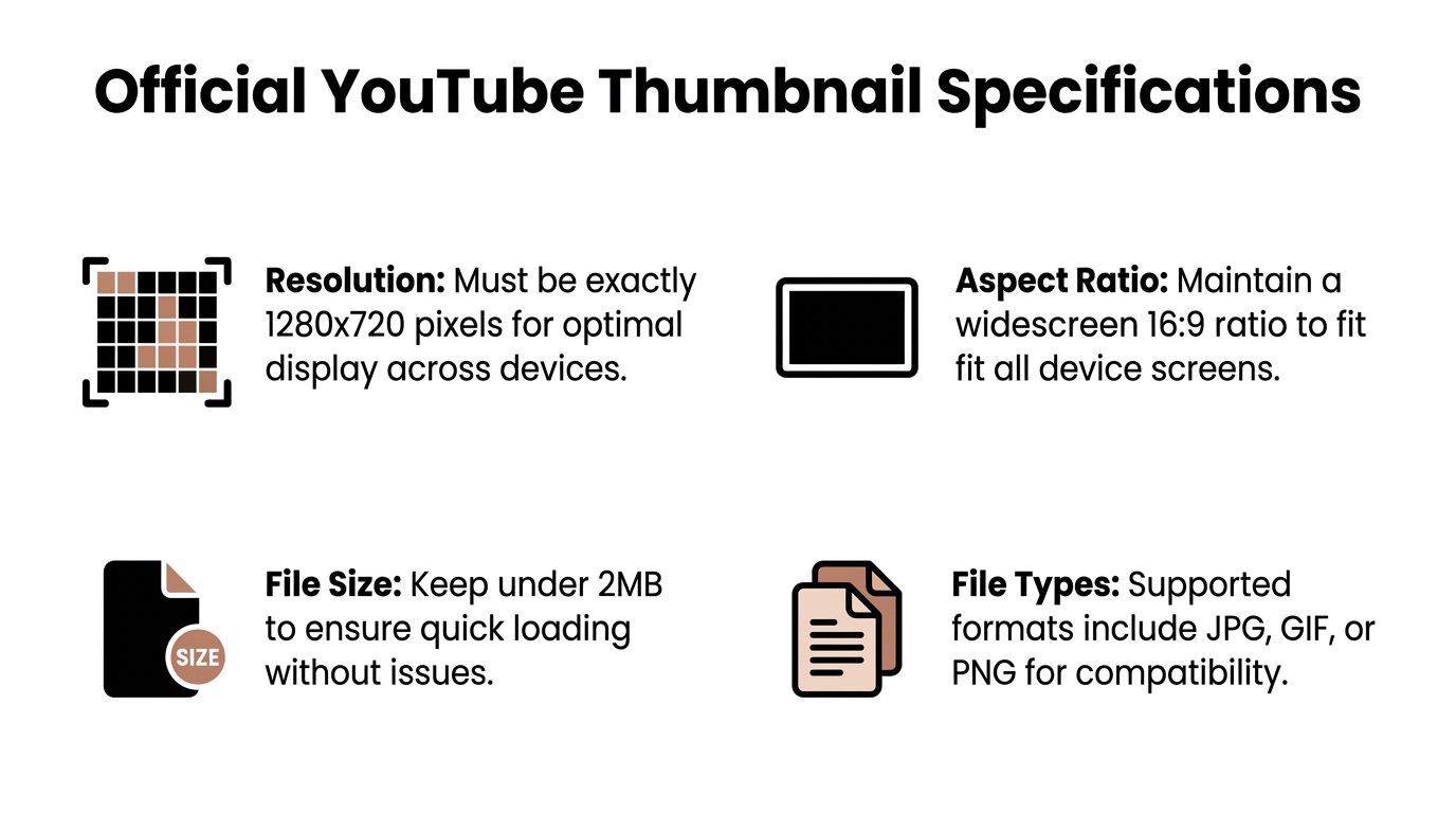
YouTube’s standard thumbnail blueprint is 1280×720 pixels with a 16:9 aspect ratio. That format became the standard because YouTube displays thumbnails across very different contexts, from small mobile previews to larger TV displays, and the same image needs to hold up everywhere, as explained in vidIQ’s breakdown of YouTube thumbnail dimensions.
The four specs that matter most
Consider these fundamental requirements.
SpecificationRequirement
Resolution
1280×720 pixels
Aspect ratio
16:9
Minimum width
640 pixels
File size
Under 2MB
File formats
JPG, PNG, GIF
What each spec means
Resolution
1280×720 is the standard canvas size. It gives you enough detail for clear display while staying practical for upload and compression.
If you design much smaller than that, your image risks looking soft when YouTube enlarges it. If you design at the standard size or above, you give the platform a cleaner source image to work with.
Aspect ratio
16:9 matches the shape of standard YouTube video playback. That keeps the thumbnail visually aligned with the video player and prevents awkward framing issues.
A lot of confusion comes from creators who design in square or vertical layouts because they are also posting to Instagram or Shorts. For standard YouTube videos, the thumbnail still needs to be built for a horizontal 16:9 frame.
File size
Keep the file under 2MB as the platform has to process and display your image quickly.
If your design is too heavy, export it again with a more efficient compression setting. Usually that means adjusting JPG quality or simplifying visual clutter.
File type
YouTube accepts JPG, PNG, and GIF for video thumbnails.
In practice, most creators choose between:
- JPG: Good for photo-based thumbnails and smaller file sizes
- PNG: Useful when you want crisp text and graphic elements
- GIF: Supported, though less commonly used for standard thumbnail workflows
The practical reason the standard exists
One thumbnail does not appear in one place. YouTube shrinks and scales it all over the platform.
That is why the official dimensions are not arbitrary. They are a flexible master file for many display environments.
Tip: If your thumbnail looks great only at full size in Canva or Photoshop, it is not finished yet. It needs to work when it is tiny.
Many creators search “thumbnail size for youtube videos” expecting a single number and stop there. The better mindset is this: 1280×720 is the base canvas, but your job is to create something that survives scaling, compression, and fast human judgment.
Designing for Every Screen The Thumbnail Safe Zone
You upload one thumbnail. YouTube shows it in many shapes and sizes.
Good-looking thumbnails often fail in these situations. The design may be strong on your laptop, but a phone user sees cropped text, a hidden face, or a timestamp covering the punchline.
The fix is the safe zone.
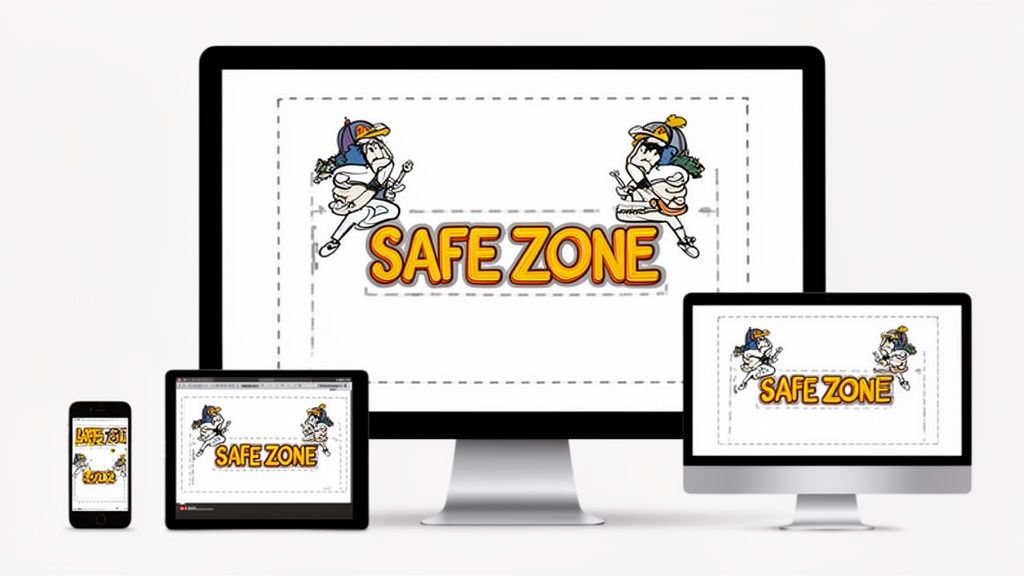
What the safe zone means
Within a 1280×720 thumbnail, the most reliable working area is roughly 1100×620 pixels centered in the frame. According to Postfaster’s 2026 thumbnail sizing analysis, important elements placed outside that area risk cropping in up to 30% of views, causing a 10–25% drop in CTR.
That is not a small design detail. It is a performance issue.
The safe zone is where your most important visual information should live:
- main face
- strongest emotion
- key object
- short text hook
- contrast point
If those drift too close to the edges, they become fragile.
What usually gets cut off first
Creators tend to lose the same elements again and again.
Text near the edges
The most common mistake is putting the biggest word at the far left or right. On some placements, it becomes partially cropped or too cramped to read.
Short text works best when it sits comfortably inside the center area, with breathing room around it.
Bottom-right details
That corner is dangerous because video duration overlays often live there. If your design places a facial expression, price tag, or keyword in that area, the interface can cover it.
Tiny secondary elements
A subtle icon, small reaction face, or thin arrow may look polished at full size. On a phone feed, it often disappears.
A better composition model
Use a simple rule. Put the “why click” message in the middle, not at the perimeter.
That usually means:
- One dominant subject
- One readable text phrase
- One clear focal contrast
Everything else is support.
If you need to tighten framing before pulling a still from your footage, a dedicated cropping tool helps. A tool like Klap’s video crop tool becomes practical, especially when you are testing how one visual idea behaves across different screen contexts.
Quick test: Shrink your thumbnail until it looks roughly like a phone preview. If the message disappears, the layout is too complex.
A short visual walkthrough helps make the idea concrete:
How to design inside the safe zone without feeling boxed in
Some creators hear “safe zone” and assume every thumbnail has to be centered and boring. Not true.
You can still create energy with:
- off-center faces that remain mostly inside the center area
- background motion blur
- large objects that extend beyond the crop safely
- color contrast around a centered focal point
The key is hierarchy. The peripheral parts can add style. The center must carry the message.
A simple before-and-after example
A weak version:
- face pushed to the far left
- three lines of small text
- key object in the bottom-right
- low contrast background
A stronger version:
- face enlarged and moved inward
- one short phrase in bold type
- object brought near center
- darker background with brighter focal elements
The design may feel less “busy,” but it will often perform better because the viewer understands it faster.
That is the core principle. Design for the smallest, messiest, fastest viewing condition first. Then let the large screens benefit from that clarity.
Beyond 1280x720 Future-Proofing with 4K Thumbnails
The standard thumbnail size for youtube videos is still 1280×720. But advanced creators should know that the minimum is not always the strongest source file.
A growing recommendation is to build thumbnails at 3840×2160. According to KDCC’s review of YouTube thumbnail size updates, YouTube’s 2026 help documentation suggests this optional 4K resolution to help future-proof against pixelation on high-density screens. The same source notes that uploading below 1280×720 can trigger aggressive upscaling that introduces blur and can reduce CTR by up to 30%.
Why larger source files can look better
YouTube compresses and resizes images. When your starting file is cleaner and more detailed, the final display often looks sharper after that processing.
That matters in three situations:
TV viewing
Large screens expose softness quickly. A thumbnail that looked acceptable on a phone can look cheap on a TV interface.
High-density monitors
Modern displays reveal edge quality. Text, outlines, and facial details hold up better when the source image starts with more resolution.
Frame grabs from video
If you pull a still from footage, a higher-resolution workflow gives you more flexibility to crop, enlarge, and refine without degrading the image too early.
The catch is file size
A bigger canvas does not give you permission to upload bloated files. The challenge is keeping quality high while staying within YouTube’s limits.
A practical workflow looks like this:
- build or upscale your design at a larger size
- export as JPG if the file is too heavy
- check sharpness after export, not just before
- reduce unnecessary texture, noise, and clutter if compression is hurting the image
If you are adapting video assets before designing the final frame, Klap’s video resize tool can help you rework source media for the right framing before the thumbnail design stage begins.
When 4K is worth it
Not every creator needs a 4K-first workflow. But it is useful when:
- your channel depends on polished visual presentation
- your niche includes tech, design, or premium brand aesthetics
- you want the thumbnail to stay crisp across newer screens
- you often crop heavily from still frames
Practical rule: Treat 1280×720 as the baseline requirement. Treat 4K as a quality edge for creators who want cleaner results after compression and scaling.
The key insight is not “bigger is always better.” It is that source quality affects final perceived quality. If viewers sense a thumbnail looks soft, amateur, or compressed, they often read that as a signal about the video itself.
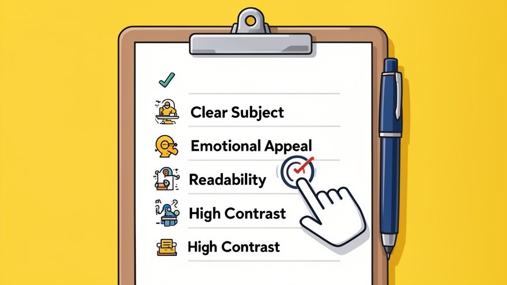
A Step-by-Step Checklist for High-CTR Thumbnails
Specs get your file accepted. Design gets it clicked.
This is the part creators care about most, because it turns the technical rules into real-world view potential. A high-performing thumbnail usually makes one clear promise, visually, in less than a second.
Start with one idea, not five
If a thumbnail tries to communicate everything in the video, it usually communicates nothing clearly.
Pick the one thing that earns curiosity:
- the surprising result
- the emotional reaction
- the dramatic contrast
- the object or moment people instantly understand
A cooking video does not need every ingredient in frame. A finance video does not need six charts. A tutorial does not need the entire process shown at once.
One idea wins.
Use text like a headline, not a paragraph
Thumbnail text should support the image, not repeat the title word for word.
Good text is:
- short
- bold
- easy to scan
- emotionally or conceptually specific
Weak text:
- “How I Built My Business From Scratch in 90 Days”
Stronger thumbnail text:
- “From $0”
- “Big Mistake”
- “I Was Wrong”
The title can carry the detailed explanation. The thumbnail should carry the instant hook.
Run the squint test
Open the thumbnail and squint at it, or zoom way out.
If you can still tell what the focal point is, the hierarchy is probably working. If everything blends together, the design needs simplification. Contrast is especially important in this situation.
What strong contrast looks like
- bright subject against darker background
- dark text box against lighter image area
- warm skin tones against cool backgrounds
- one accent color used intentionally
What weak contrast looks like
- light text over a bright sky
- red text on a busy orange scene
- low-energy colors everywhere
- no separation between subject and background
Use faces with purpose
Human faces work because people read emotion quickly. A look of shock, focus, confusion, relief, or delight creates instant narrative tension.
But not every face helps.
A useful face is:
- large enough to read
- emotionally clear
- connected to the topic
- placed where the eye lands first
A useless face is tiny, neutral, or competing with too many other elements.
Build visual hierarchy
A strong thumbnail guides the eye in order.
Usually the viewer should notice:
- the face or main object
- the text hook
- the secondary proof element
If all three scream at the same volume, the thumbnail feels noisy.
A clean hierarchy often comes from scale:
- make the main subject bigger
- reduce supporting clutter
- leave space around the focal point
- let one element dominate
Design rule: If two elements feel equally important, decide which one matters more and make that one visibly larger.
Match the promise of the video
Here, strategy beats clickbait.
A thumbnail can create intrigue without misleading people. The best thumbnails sharpen the truth. They do not fabricate it.
For example:
- a transformation video can show the before and after
- a tutorial can show the result, not every step
- a reaction video can show the emotional peak
- an experiment can highlight the decisive moment
If the click comes from confusion and the video opens with a mismatch, viewers leave disappointed. That hurts trust.
Keep brand consistency subtle
You do not need a giant logo in every corner. Most channels benefit more from repeatable style than obvious branding.
Consistency can come from:
- the same font family
- familiar color treatment
- recurring framing style
- similar face crop
- recognizable text placement
This helps loyal viewers spot your work quickly without making each thumbnail feel cloned.
A practical do and don't list
- Do enlarge the main subject: Small subjects die in the feed.
- Do reduce word count: Fewer words usually hit harder.
- Do darken busy backgrounds: This helps text and faces stand out.
- Don’t decorate every empty space: Empty space improves clarity.
- Don’t rely on subtle details: Tiny symbols and fine lines disappear first.
- Don’t make the thumbnail and title compete: They should complement each other.
A simple workflow in Canva or Photoshop
Many creators overcomplicate this. A reliable workflow is enough.
- Open a 16:9 canvas.
- Drop in one strong frame or photo.
- Enlarge the face or main object.
- Darken or blur the background if needed.
- Add a short text hook in bold type.
- Check the center composition.
- Zoom out hard.
- Export and review on both desktop and phone.
Do that consistently and your thumbnails start getting more disciplined fast.
Thumbnail Strategy for Repurposed Content and Shorts
Most thumbnail advice becomes less effective here.
A custom thumbnail for a standard YouTube video does not solve the visual packaging problem for vertical clips. In fact, when a 16:9 YouTube video is repurposed into vertical Shorts, that custom thumbnail is not used. Mediacube notes that this leaves creators with a major guidance gap, especially because 70% of YouTube watch time occurs on mobile in the context of cross-platform viewing behavior, as discussed in their analysis of thumbnail strategy gaps for repurposed content.
The first seconds become the thumbnail substitute
For Shorts, Reels, and TikTok, the opening frames do the job a thumbnail does in long-form discovery.
That means your visual hook has to live inside the clip itself:
- strong face framing
- immediate motion
- obvious subject
- readable on-screen text if used
- no slow visual warm-up
If the clip opens with a wide shot, empty room, or low-energy transition, it feels invisible in a vertical feed.
Long-form packaging and short-form packaging are different
A long-form YouTube thumbnail can rely on a designed still image and title pairing.
A vertical clip usually depends on:
- the first visual beat
- the first spoken line
- the on-screen caption treatment
- center-weighted framing for mobile
That difference matters when you repurpose content from interviews, podcasts, webinars, or tutorials. A frame that worked as a horizontal still may not carry the same punch when translated into a vertical scroll environment.
What creators should do instead
Treat repurposing as a packaging redesign, not just a resize.
A smart workflow:
- Identify the strongest hook moment.
- Reframe for vertical so the face or key object fills the screen.
- Make sure the opening second communicates tension or payoff.
- Use captions to reinforce the hook, not explain the whole clip.
- Create a separate long-form thumbnail strategy for the horizontal version.
If you want a practical walkthrough for turning existing videos into short-form assets, this guide on how to create YouTube Shorts from an existing video is a useful next step.
A useful mindset shift: For long-form, you design the click before the play. For Shorts, you often design the click through the opening frame itself.
Creators who understand this stop forcing one visual asset to do two different jobs. That is usually where repurposed content starts to feel native instead of recycled.
Conclusion Your Thumbnail Is Your First Impression
A thumbnail is a tiny image with an oversized job. It has to stop the scroll, set the expectation, and make your video feel worth a click in an instant.
The baseline is simple. Use the correct thumbnail size for youtube videos, keep the file clean, and respect the horizontal format. Then get smarter about where the performance gains happen.
The four ideas worth keeping
- Start with the standard: 1280×720 and 16:9 keep you inside YouTube’s core requirements.
- Design for the safe zone: If the center does not communicate the hook, the thumbnail is fragile.
- Use higher resolution strategically: 4K source files can help future-proof quality on sharper screens.
- Adapt for repurposed content: Long-form thumbnails and short-form visual hooks are not the same thing.
That last point matters more every year. Creators are no longer publishing in one format to one surface. They are packaging ideas across feeds, screens, and viewing habits. The thumbnail has to fit that reality.
The broader shift in mindset
Do not treat thumbnails like admin work. Treat them like distribution strategy.
A strong video with weak packaging often stalls. A strong video with sharp packaging gets the chance to compete. That is the whole game.
If your views feel inconsistent, start by improving the first impression. Tighten the composition. Simplify the promise. Check legibility at small size. Build a thumbnail that earns the click.
That work compounds. Not because it is flashy, but because it gets more of your videos seen.
If you already have long-form videos and want to turn them into social-ready clips faster, Klap helps you transform existing content into vertical shorts with AI-powered reframing, captions, and quick editing controls. It is a practical way to extend the life of every video you publish while keeping your content ready for Shorts, Reels, and TikTok.
