Vertical Video Editing: Complete Step-by-Step Guide 2026
Other
You've got a two-hour interview, a podcast, or a webinar sitting on your drive, and turning it into useful social content feels almost as difficult as recording it. The wide master may be polished, but it wasn't composed for a phone held upright, captions, interface overlays, or a viewer who might leave before the speaker finishes the first sentence.
Vertical video editing solves more than aspect ratio. It changes how you select moments, preserve subject hierarchy, control gaze flow, time text, and decide where visual information belongs. The strongest short clips aren't just horizontal videos with the sides removed. They're deliberately rebuilt for mobile viewing.
From Raw Footage to Scroll-Stopping Clips
The first mistake is treating a long-form recording as a finished video that only needs trimming. I treat it as a searchable library of moments. A thoughtful answer, a surprising disagreement, a clear explanation, or a physical reaction can each become a standalone short, but only if the segment makes sense without the surrounding conversation.
That shift matters because portrait viewing became native to smartphones, not because editors suddenly decided that tall frames looked fashionable. By 2017, a widely cited benchmark reported that vertical videos generated nearly 4x more engagement than square videos on Facebook and 2.5x more on Twitter. The same source reported that 90% of Twitter video views came from mobile devices, while vertical videos on Snapchat were watched to completion 9 times more often than horizontal videos. These figures are documented in the original vertical video engagement benchmark.
MetricValue
Facebook vertical video engagement compared with square
Nearly 4x
Twitter vertical video engagement compared with square
2.5x
Twitter video views from mobile devices
90%
Snapchat completion rate for vertical compared with horizontal
9x
The practical lesson isn't to force every sentence into a short. It's to listen for moments that already contain tension or resolution. A clip that begins with a question, challenges an assumption, reveals a useful process, or ends with a strong conclusion usually needs less editorial invention than a clip chosen only because it contains an attractive camera angle.
Treat the archive as raw material
Open your transcript or timeline and mark moments before building a vertical sequence. Look for a complete thought, then check whether the first line can function as an entry point for someone who never saw the full episode. If it can't, either find a sharper opening elsewhere in the recording or construct a brief setup from earlier material.
Repurposing also works better when each short has a job. One clip might answer a practical question, another might create curiosity, and a third might direct viewers toward the full conversation. A useful workflow reference is this guide to turning long videos into short videos, particularly when you're organizing several candidate moments from one recording.
For distribution strategy beyond the edit itself, the Instagram Reels growth playbook offers useful context on packaging and publishing. Editing can improve clarity and retention, but it can't rescue a segment with no point.
Editorial rule: If the viewer needs your introduction, the guest's biography, and several minutes of context before the clip becomes interesting, keep scouting.
Selecting and Preparing High-Impact Segments
A good vertical clip usually reveals its value quickly, but “quickly” doesn't mean cutting every pause. Before touching effects, assess the source material as an editor and as a viewer.
Start with a rough pass through the transcript or waveform. Mark statements that are interesting, funny, educational, emotionally charged, or framed as questions. Then play each candidate from the proposed first frame. If the speaker spends the opening seconds saying “as I mentioned earlier,” the clip may need a new lead-in, a tighter in-point, or a short text hook that supplies the missing context.

Score the moment before you style it
I use a simple selection test:
- Find the promise. What will the viewer learn, feel, or understand by staying?
- Check independence. Does the clip have a beginning, development, and payoff without relying on the full episode?
- Inspect the visual action. Is the subject stationary, moving, sharing the frame, or switching positions?
- Listen for edit points. Natural pauses and sentence endings give you room to remove dead air without creating an awkward rhythm.
- Test the ending. A strong final statement is usually more valuable than a dramatic transition.
The visual-action check prevents a common failure. A beautifully framed shot may contain several people, environmental context, or lateral movement that disappears when converted to portrait. An interview with one speaker is often easier to adapt, but even then, a hand gesture, a second participant, or a meaningful reaction may sit outside the vertical crop.
Build a candidate timeline, not a finished edit
Place your selected segments in a temporary sequence and remove unused material before applying heavy processing. This keeps the creative decision separate from the styling decision. It also makes comparison easier. A clip that looks promising in isolation may feel repetitive beside another clip with the same opening rhythm or visual pattern.
For cinematic footage, don't assume that adding a blurred duplicate behind the main image automatically makes the result feel intentional. A blurred background can fill unused space, but it may also advertise that the source wasn't composed for portrait viewing. Use it when the subject remains clear and the background supports the image. If the frame still feels cramped, redesign the shot rather than hiding the problem.
The best preparation is often a short paper edit or transcript edit. Decide what survives before you spend time animating captions, adding sound effects, or matching visual treatments across a batch.
Mastering Reframing and Mobile-Safe Composition
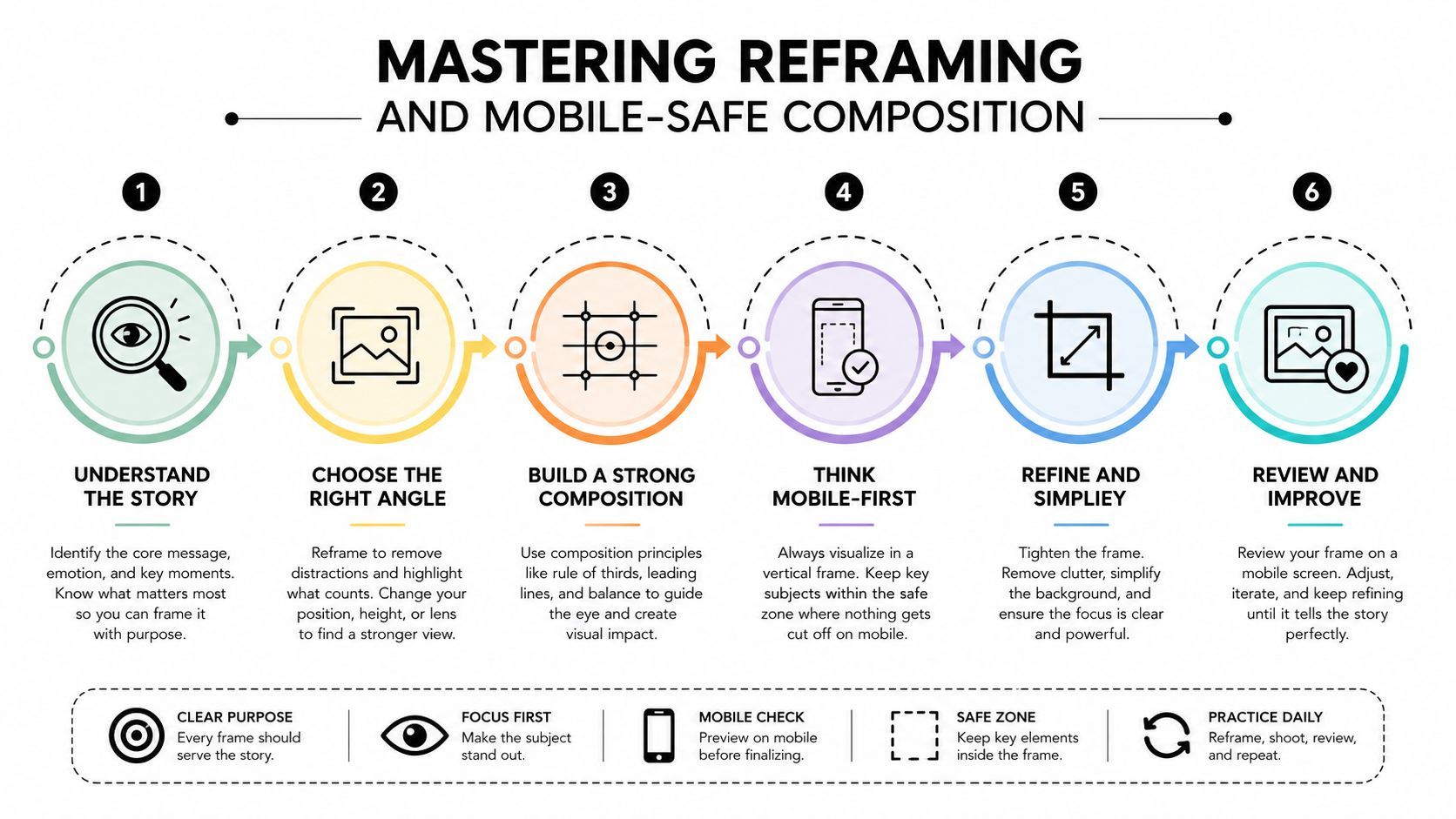
A center crop is fast, but it rarely understands the scene. It can cut off the person who is speaking, remove the object being discussed, or place a face too close to the edge. Professional vertical video editing uses shot-by-shot reframing, with the crop following the active subject and preserving the visual relationship that makes the shot understandable.
The standard working canvas is 9:16 at 1080×1920, and expert guidance recommends speaker tracking rather than relying on a simple center crop. The vertical podcast clip format guidance also recommends keeping captions within the middle 60% of the frame, with safe zones of roughly 15% at the top and 20% at the bottom to reduce interference from platform interface elements.
Follow the subject, not the frame center
For a single talking head, place the eyes and face where they feel stable, then animate the crop only when the subject's movement requires it. For a two-person interview, alternate between close reframes, a wider vertical view, and split-screen only when both reactions are editorially important. A split-screen can preserve conversation logic, but it reduces the size of each face and leaves less room for readable text.
Cinematic adaptation becomes difficult here. Research on mobile and cinematographic adaptation found that the central vertical axis becomes a path of least resistance for viewer attention, while horizontal composition gives way to vertical dynamics and Z-axis depth. The study on mobile adaptation and cinematographic framing supports a useful editorial conclusion: cropping a widescreen composition can destroy the original hierarchy.
Ask three questions for every shot:
- Who owns attention? Keep the principal speaker or action visually dominant.
- What context is essential? Preserve the prop, reaction, or spatial cue that makes the statement clear.
- Where does the eye travel? Leave space in the direction of a gaze or movement instead of trapping the subject against the edge.
A blurred background or enlarged duplicate layer can help when the original image has valuable detail but doesn't fill the portrait canvas naturally. It shouldn't become a substitute for tracking, selective cuts, or a better shot choice.
Audit the interface edges
Before export, preview the clip as if platform controls were covering the frame. Keep faces, logos, product details, and important gestures away from the top and bottom boundaries. Then inspect the feed preview, not only the full-screen player. Instagram Reels use a 9:16 frame at 1080×1920, but a Reel shown in the main feed is cropped to 4:5, which can remove about a third of the frame, as explained in Instagram Reel size and length guidance.
For a practical aspect-ratio workflow, use this guide to convert video aspect ratio, then make a manual pass over every shot. Automation can suggest a crop. The editor still decides whether the crop preserves meaning.
Adding Captions That Capture and Retain Viewers
Captions should carry the edit, not sit on top of it as decoration. Many social viewers watch without sound, so open captions are part of the visual storytelling and accessibility layer. A transcript pasted onto the screen will technically communicate the words, but it often creates dense blocks that compete with faces, products, and movement.
A sourced 2026 industry summary reported that captions increased watch time by 40%, and that the first 1 to 2 seconds determined 80% of performance. Those figures appear in the short-form video statistics summary. Use them as a reason to test caption treatments, not as permission to cover the frame with oversized text.
Design for quick reading
Choose a clear typeface with strong contrast against the footage. Short lines are easier to scan than full-sentence paragraphs, and emphasis should identify the important word or phrase rather than animate every word equally. If every syllable changes color, the captions become visual noise.
Keep text in the middle portion of the frame, away from the absolute bottom. This follows the safe-zone guidance described earlier and leaves room for platform controls. If the speaker's face occupies the lower-middle area, move captions upward without covering the eyes or mouth. Placement should respond to the shot, not obey one fixed template.
A useful caption pass looks like this:
- Transcribe accurately. Correct names, terminology, and punctuation before styling.
- Break by meaning. Let each caption unit express one thought or beat.
- Emphasize selectively. Highlight the term that carries the point, not every noun.
- Check contrast. Use a background treatment or outline when footage changes brightness.
- Review at phone size. Text that looks elegant on a large monitor may be unreadable on a mobile screen.
Synchronize text with speech and cuts
Timing affects comprehension. Subtitle standards summarized in independent research recommend starting text on or before the audio and allowing up to 12 frames after speech ends when necessary. Captions should also remain at least 2 frames away from cuts to reduce readability loss. The vertical-video subtitling research provides the relevant timing guidance.
Don't force captions to match every breath if the result makes them flicker. Instead, synchronize meaningful phrases with the speaker's delivery and use cuts to reinforce the same rhythm. If a caption appears before the viewer understands why it matters, it may function as a hook. If it arrives after the statement has passed, it becomes a correction rather than support.
Use the Klap captions workflow as one way to accelerate transcription and styling, but proofread the output. Automated captions can misread names, accents, overlapping speech, and specialist vocabulary. The final responsibility remains editorial.
Pacing, Hooks, and Sound Design Techniques
The first edit decision is whether the clip needs energy or clarity. A fast-cut style can make an interview feel native to a short-form feed, but it can also make a thoughtful point sound anxious. A restrained edit may look less dramatic while keeping the speaker credible and easy to follow.
ApproachWorks well whenMain trade-off
Minimal cuts
The speaker has strong delivery and the idea needs trust
Can expose pauses or a slow opening
Tight jump cuts
The source contains repetition, dead air, or weak transitions
Can feel nervous if every pause disappears
B-roll and overlays
The argument benefits from examples, objects, or demonstrations
Can distract from the central statement
Stylized transitions
The brand already uses a recognizable visual language
May look generic when added without editorial purpose
Start by testing the opening without music. If the first spoken line has a clear promise, let it lead. If it begins with context, rearrange the clip so the most compelling statement arrives first, then add the minimum setup needed for comprehension. A hook can be a claim, question, contrast, visual reveal, or moment of reaction. It doesn't need a loud sound effect.
Match cuts to meaning
Remove pauses that communicate nothing, but keep pauses that create anticipation or reveal emotion. Cutting between every sentence may increase movement while reducing authority. Conversely, leaving every hesitation intact can make a valuable answer feel unedited.
Use punch-ins when the speaker reaches a key point, not as a substitute for a new camera angle. A modest scale change can mark a beat. Repeated aggressive zooms quickly become a visual habit viewers notice instead of a tool that guides attention.
Sound design should serve the same hierarchy. Dialogue comes first, music supports mood, and effects clarify an action or transition. A subtle impact under a title can provide structure. A constant layer of whooshes, risers, and bass hits can make a simple explanation feel overproduced.
Choose a sound strategy deliberately
For educational interviews, clean dialogue and restrained music usually outperform a crowded mix from a credibility standpoint. For demonstrations, recipes, sports, or physical transformations, rhythmic cuts and carefully placed effects may add useful momentum. The right choice depends on what the viewer must notice.
Keep the audio relationship consistent across the clip. Duck music under speech, remove duplicated tracks when layering video, and listen on both headphones and a phone speaker. A mix that sounds polished in a quiet studio may bury consonants in a noisy commute.
Exporting and Automating with AI Tools
Export is where a good edit can become a poor upload. Build the project at 1080×1920, check the crop in a feed-style preview, and confirm that captions, faces, logos, and calls to action remain clear. The exact delivery preset may vary by platform and source footage, so the safe practice is to inspect the rendered file on a phone before scheduling a batch.
Keep a clean master without platform-specific overlays, then create versions for TikTok, YouTube Shorts, and Instagram Reels when their presentation needs differ. Don't bake in interface prompts or place important information at the extreme edges. If the source is HDR, test the upload on the target platform because color handling can vary between devices and viewing surfaces.
Automate repetition, not judgment
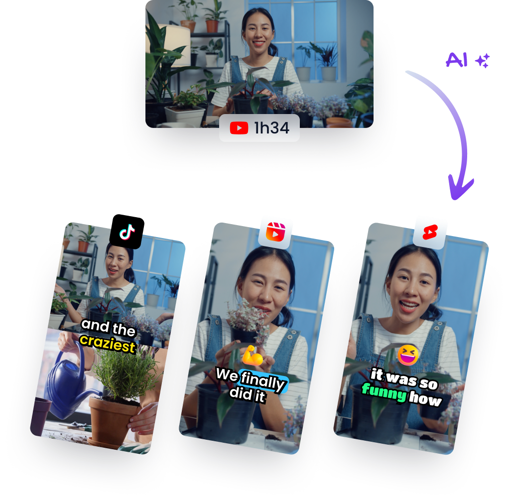
AI is most useful when it removes mechanical work while leaving editorial decisions visible. A practical automated workflow can identify candidate segments, detect the active speaker, create a 9:16 reframe, generate captions, and prepare several versions for review. The editor should still reject clips with weak context, correct transcription errors, adjust subject hierarchy, and decide whether a crop feels natural.
Tools such as Klap fit this workflow by importing a long-form video or YouTube link, identifying potential short clips, reframing them for vertical viewing, and adding captions that can be reviewed and edited before export. Automation speeds up discovery and repetitive formatting. It doesn't know whether a guest's pause is emotionally important, whether a joke requires setup, or whether a two-person composition should become a split-screen.
Create a repeatable review queue
Use a structured review pass rather than approving clips as soon as they render:
- Content pass: Confirm that the clip has a clear point and no missing context.
- Composition pass: Check every reframe for faces, gestures, props, and gaze direction.
- Caption pass: Correct words, timing, line breaks, contrast, and safe-zone placement.
- Audio pass: Listen for clipped dialogue, doubled tracks, distracting effects, and uneven levels.
- Mobile pass: Watch the finished file on a phone in both full-screen and feed-like views.
For teams comparing mobile editing software, a practical overview of Instagram video apps for small businesses can help identify where a lightweight app fits and where a desktop editor remains necessary. The trade-off is control versus throughput. Manual editing gives you finer control over performance and composition, while automation makes it realistic to process a large archive without repeating the same setup work.
Final quality check: If the automated crop makes the speaker look trapped, the captions cover the subject, or the hook depends on missing context, fix the editorial problem before exporting another version.
Klap can help turn long-form recordings into reviewable vertical clips with AI-assisted segment selection, reframing, captions, and export preparation. Upload a video or provide a YouTube link, review the generated shorts, and visit Klap to start building a faster vertical video editing workflow.