Unlock the Power of Simplicity in Communication
Jan 23, 2024
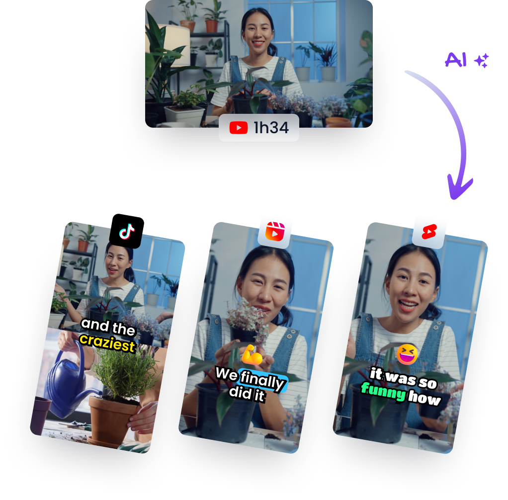
Content MarketingTLDR: Watch the AI-generated short
In a world inundated with complex jargon and convoluted sentences, embracing simple language can be a game changer. Cognitive fluency—the ease with which our brain processes information—is greatly influenced by how content is presented to us. By incorporating white space, shorter sentences, and familiar typefaces into our writing, we not only make text aesthetically pleasing but also significantly impact reader perception and understanding.
Create Breathing Room
White space is an essential element of design that helps declutter written material. It's the empty space between paragraphs, around images, or even within lines of text—anywhere that gives readers' eyes a break from continuous content. Using ample white space invites people into your message rather than overwhelming them with wall-to-wall text.
Practical Takeaway:
- Use paragraph breaks generously.
- Avoid lengthy blocks of text.
- Incorporate bullet points or numbered lists for easier scanning.
Embrace Shorter Sentences
Long-winded sentences can lose readers along the way. Conciseness is key; it ensures clarity and retention. When you use short sentences, you're allowing ideas to be digested bit by bit instead of forcing readers to unpack dense information all at once.
Practical Takeaway:
- Break down complex thoughts into multiple sentences.
- Be direct—choose simplicity over complexity when conveying messages.
Choose Familiar Fonts
The psychology behind font choice is often underrated yet surprisingly influential in cognitive fluency. A study highlighted how participants estimated completion time for an exercise routine based on the font used: those reading instructions in Arial—a straightforward font—took less time than those reading in Brushy—an ornate typeface.
This demonstrates that readability extends beyond word choice; visual ease plays a crucial role as well.
Practical Takeaway:
- Opt for clean and clear fonts like Arial or Helvetica for body text.
- Reserve decorative fonts only for accents where appropriate—not main content areas.
Conclusion: The Clarity Edge
Simplicity isn't just about minimalism—it's about making sure your audience understands what you're saying without additional effort. Whether it's through thoughtful design decisions or crafting concise copy free from industry jargon, remember that communicating effectively means prioritizing cognitive fluency above all else.
By applying these practical tips to your written materials—from business emails to marketing brochures—you'll ensure not only greater engagement but also enhanced comprehension among your readership.